
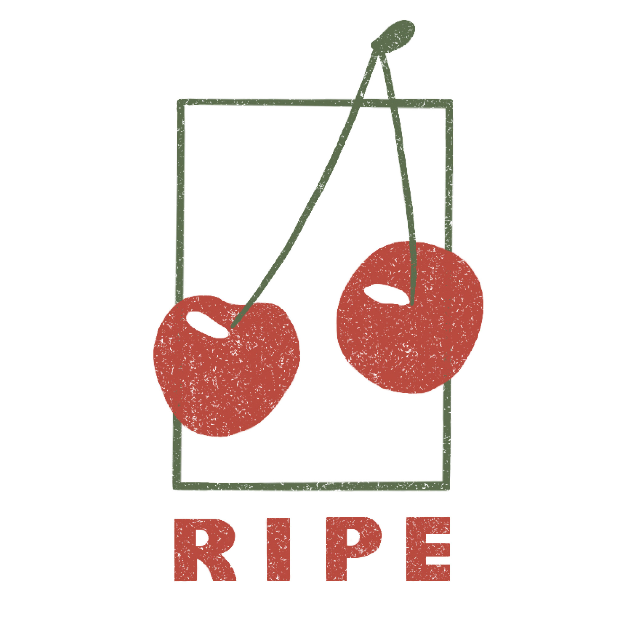

Ripe Logo and Branding
I was approached by Tara Kelley, craftsperson and small business owner of Ripe, for a new identity for her handmade wood-turned bowls that fit her minimalist aesthetic. The main uses were a logo for her social media presence as well as a wood-burning stamp to brand her bowls.
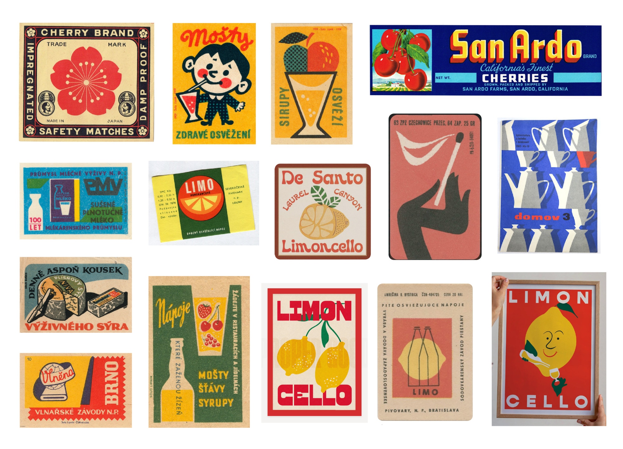
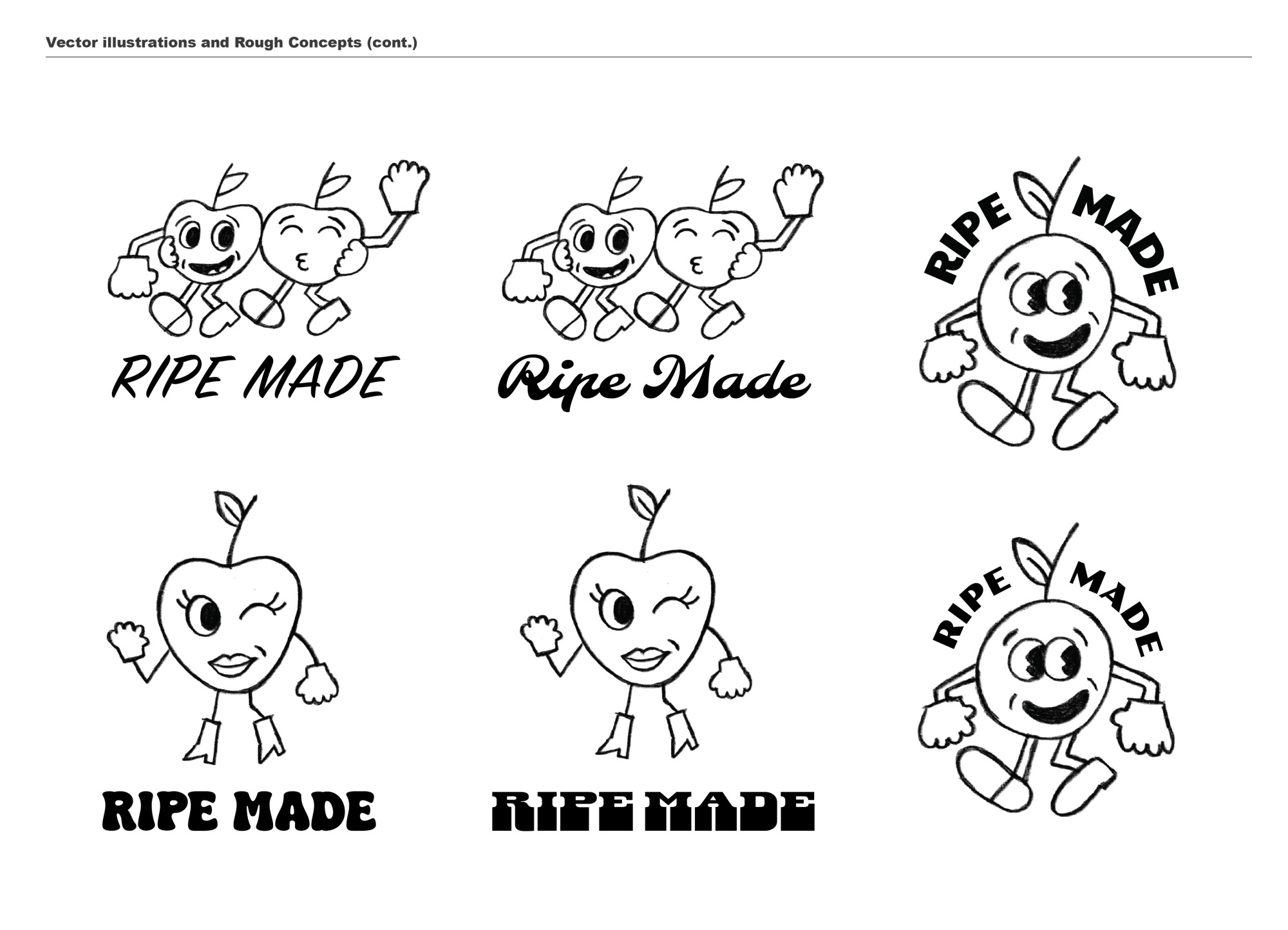
She was looking for a retro-inspired logo and our first creative direction paired 70’s-inspired typefaces with rubberhose cartoon characters of the 30’s and 40’s. After our first round of feedback, she decided this direction didn’t align with her brand or vision, so we opted for a more refined logo that drew inspiration from vintage apéritif posters and Czech matchbooks.
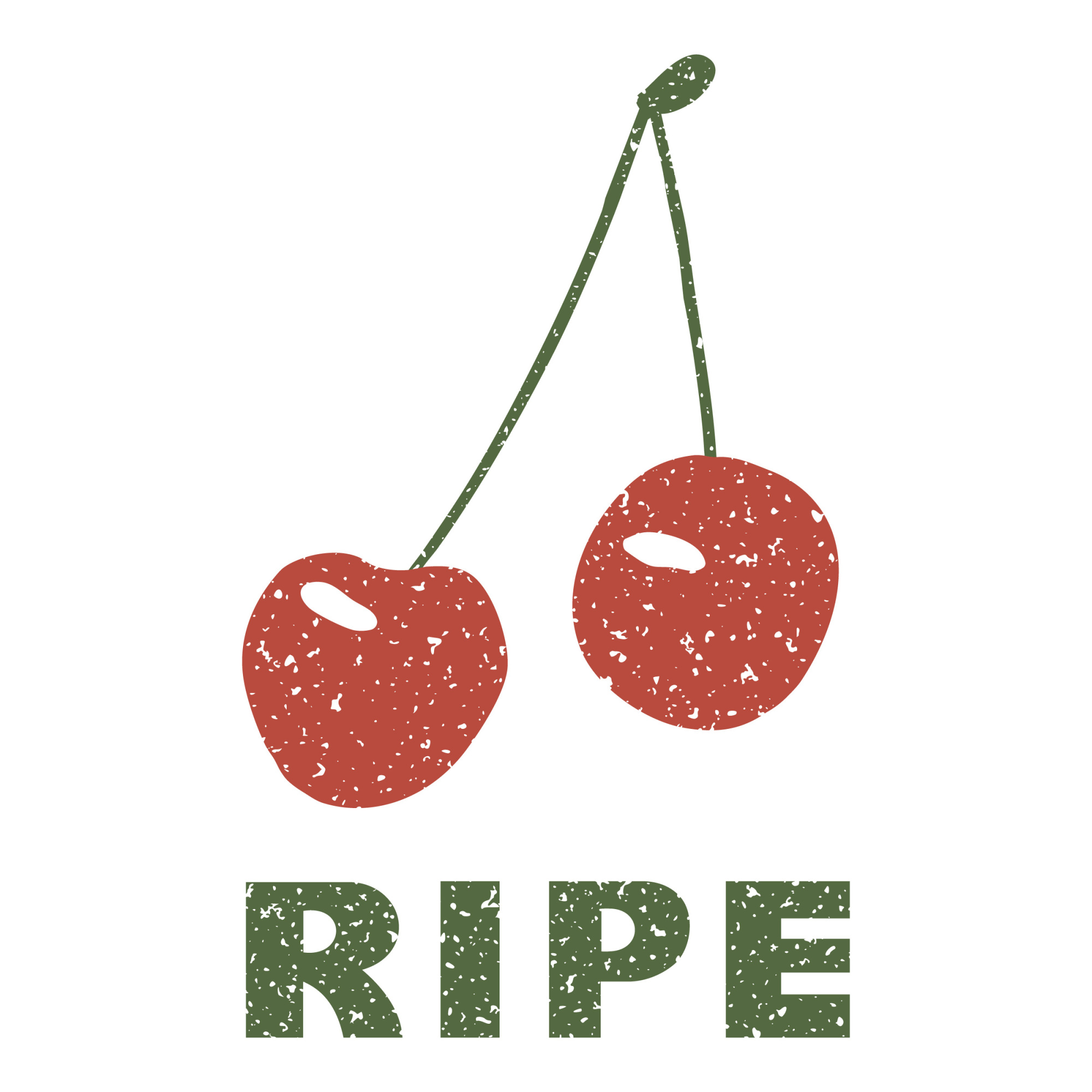
The imagery on this page includes the final logo as well as various iterations I designed throughout the process. We had both liked the iteration with the rectangle, but she was concerned about how it would translate via stamp. The letters were hand-drawn and inspired by early-to-midcentury WPA posters.


